Every year, Pantone selects a Color of the Year to reflect the cultural mood and influence trends across design, branding, fashion, and more. It’s not just about color — it’s about capturing where we are and where we’re heading.
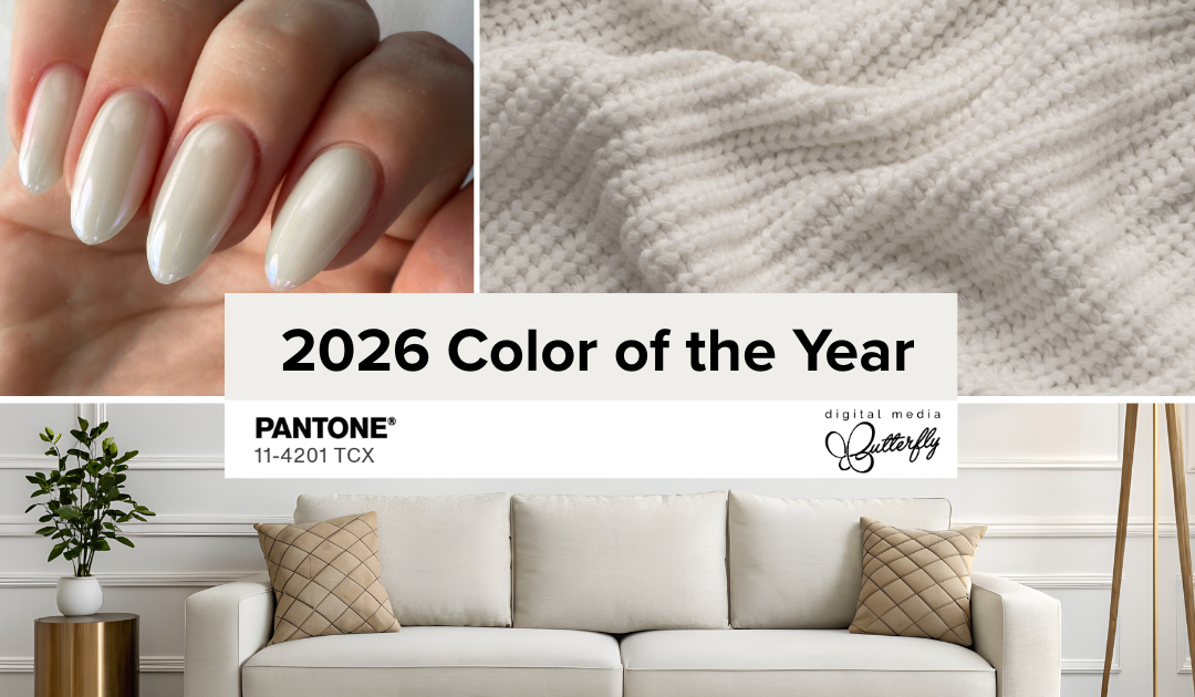
For 2026, that color is Pantone 11-4201 Cloud Dancer — a soft, airy white that brings clarity, calm, and quiet confidence.
It’s not loud or flashy, and that’s exactly the point. Cloud Dancer reminds us that simplicity can be powerful. That space, subtlety, and thoughtful design can often speak louder than bold statements.
From marketing campaigns to product packaging, brand visuals to digital design, this warm white offers a clean slate — helping your message stand out without the noise.
In Design: Clean, Intentional, and Inviting
We love this color in design — especially for brands that want to feel modern, clear, and thoughtful.
- On websites, Cloud Dancer-style whitespace keeps things clean and user-friendly.
- In printed materials, it adds balance and makes bold messaging pop.
- For logos, packaging, or social graphics, it supports without competing — letting the real story take center stage.
This is a color that invites trust and helps people breathe a little easier while they engage with your brand.
In Marketing: Simplicity That Builds Connection
Let’s be honest — marketing is crowded. Attention spans are short, and visuals matter. Using color intentionally can help cut through that clutter.
Cloud Dancer offers a calm, grounded alternative to visual overload. It doesn’t scream for attention — it draws people in with clarity and ease.
Here’s how we see it showing up:
- Refreshing your brand palette with softer, more modern neutrals
- Designing social graphics that give your message room to breathe
- Using lighter tones in email layouts or landing pages to reduce overwhelm and guide focus
Simple, calm design choices can go a long way in building trust — and conversions.
Why Color Trends Matter (Even If You’re Not “Trendy”)
Color trends reflect more than aesthetics — they mirror how people are feeling and what they’re drawn to.
Using a tone like Cloud Dancer doesn’t mean chasing trends. It’s about showing your audience that your brand is thoughtful, current, and aligned with what matters. Even subtle visual updates can signal clarity, growth, and trust.
Wondering how to use Cloud Dancer in your brand or marketing?
Whether you’re thinking about small updates or a bigger refresh, we’d love to help you bring more clarity, calm, and intention to your visuals this year.
